

Video Tutorial
Getting Started
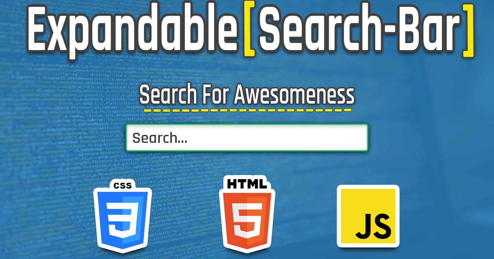
In this tutorial, we will be creating a Pure CSS and Vanilla javascript Expandable search bar from scratch with a cool animation effect.
We will be using CodeSandBox.io as the Online Code editor to make sure that everyone is capable of following the tutorial without any problems or hassles.
Select a Vanilla Javascript Project from the list of templates on CodeSandBox.
The only knowledge you need is to know basic CSS (we will be using SASS a CSS preprocessor for making it easier and simpler) and basic DOM manipulation on javascript.
You can check out the finished Sandbox of this tutorial.
Creating the Search Bar Structure
First, we need to create the Structure of the search bar on HTML so open up your HTML page file (index.html)
<!DOCTYPE html>
<html>

<head>
    <title>Parcel Sandbox</title>
    <meta charset="UTF-8" />
</head>

<body>
    <div id="app">

        <div class="search-content">
            <div class="search-title">
                <h3>Search for your next thing</h3>
            </div>
            <fieldset>
                <input type="text" id="search-bar" placeholder="Search..."/>
                <div class="icons-container">
                    <div id="search-icon"></div>
                </div>
            </fieldset>
        </div>
    </div>
    <script src="src/index.js">
    </script>
</body>

</html>
For the structure, we have a main container of the search bar with a class .search-content that has to hold two main components the search Title and the HTML5 fieldset (which is basically a grouping wrapper) which has the input search and a icons container.
The Search Title container will be used to hold and apply the falling animation of the text.
Also, make sure to embed the index.js script since it is going to be used later on for adding functionality to the search bar and apply the animation of the text on search input focus.
Adding CSS (SASS) Style
Since making a good looking search input is all about being creative and adding cool CSS effects and animations so open up (or create) the style.scss make sure it has the SASS extension to use it on CodeSandBox.
First, let’s make sure that our main body and HTML tags are taking the full page width and height since we need to center the search bar both vertically and horizontally.
* {
  box-sizing: border-box;
}

html, body {
  width: 100%;
  height: 100%;
  font-family: sans-serif;
}
The app main container also needs to have full width and height.
#app {
  width: 100%;
  height: 100%;
  display: flex;
  justify-content: center;
  align-items: center;
  flex-direction: column;
}
And, since we are using SASS I love putting the main theme colors of the application we are working on as variables.
$shiny-blue: rgba(157, 194, 219, 0.89);
$nice-blue: rgb(54, 147, 209);
$shiny-green: #22b194;
$nice-green: rgba(100, 211, 189, 0.877);
Let’s get into the search-content which represent the wrapper of the search-bar and the title, so, we also add the title container to have an absolute position, therefore, we can toggle the animation and have the nice text falling animation.
/*Parent Container*/
.search-content {
  display: flex;
  flex-direction: column;
  justify-content: center;
  align-items: center;
  position: relative;
  .search-title {
    color: $shiny-green;
    font-weight: 400;
    /*Absolute Position for Animation*/
    position: absolute;
    top: -7em; /*< Start way of top*/
    width: 15em;
    opacity: 0; /*< hidden by default (when the input is not expanded)*/
    transition: all, 0.62s ease-in-out; /*< all transition to be applied on any change*/
   /*To toggle text animation and make it visibale*/
   &.show {
      top: -3.4em;
      opacity: 1;
    }
  }
Since we are using SASS we can nest elements inside each other as (parent > child) it is better for reading and having a smooth CSS with fewer bugs.
the search-content have a flexbox display and we use it for centering all its children to the center.
The search title has an absolute position and a topmost off (-7em) to start on top then we can bring it down with a smooth and elegant fade-in & fall-down animation by toggling the .show class.
You can play with the values to make it look perfect for you.
Also, don’t forget the fieldset which is the wrapper of the input and the icons-container.
fieldset {
  outline: 0;
  border: 0;
  position: relative;
}
The reason behind relative positioning is because we will be applying an absolute position to the search-icon, therefore, the parent has to explicitly specify a relative to the position in order for there children to be relatively positioned according to it.
Now, let’s add some style to our search bar to make it loop a bit better with some shadows and border.
#search-bar {
  /*Add some cool style to the input*/
  height: 2.8em;
  /*Start shrink*/
  width: 2.8em;
  padding: 8px;
  font-size: 16px;
  border: 0;
  border-radius: 4px;
  color: #535c68;
  box-shadow: 0px 3px 19px 3px rgba(15, 15, 15, 0.2);
  /*Setup some transition for the expand animation*/
  transition: all, 0.7s;
  //on Focus Expand it
  &:focus {
    outline: 0;
    /*We just need to change the width*/
    width: 20em;
    border: 1px solid $nice-green;
    box-shadow: 0px 0px 10px 0.3px $nice-green;
    &::-webkit-input-placeholder {
      /*Show it on input expand*/
      opacity: 0.8;
    }
  }
  /*Add placeholder style (Only for Chrome)*/
  &::-webkit-input-placeholder {
    /*Start hidden since the input is shrunk*/
    opacity: 0;
    font-size: 16px;
    color: #535c68;
    width: 1px;
  }
}
The expanding effect is really simple all you need is to make sure the input by default has a small size to look like a button then when the user toggle the focus on it applies the expanding effect with some animation that is specified using the transition function of the transition property.
For the placeholder it only works for chrome through Webkit but also works with Mozilla if you added -Moz- and the main idea behind it is hiding the placeholder text when the input is shrunk then show it up in case it expanded.
Now, the input should look much better with the cool shadow effect and the elegant expanding animation.
.icons-container {
  /*Absolute positioning for putting it inside the input to look like a button icon*/
  position: absolute;
  top: 11px;
  right: 21px;
  width: 32px;
  height: 31px;
  cursor: pointer;
  /*We create the Search Icon with borders and the after CSS peudo-element*/
  #search-icon {
    /*Search icon (Circle)*/
    position: relative;
    top: 5px;
    left: 8px;
    width: 60%;
    height: 60%;
    opacity: 1;
    border-radius: 50%;
    border: 3px solid $shiny-green;
    transition: opacity 0.25s ease, transform 0.43s ease-in-out;
    box-shadow: 0px 0px 1px 0.2px rgba(170, 229, 218, 0.761);
    /*Search Icon (line)*/
    &:after {
      content: "";
      position: absolute;
      bottom: -9px;
      right: -2px;
      width: 4px;
      border-radius: 3px;
      transform: rotate(-35deg);
      height: 10px;
      background-color: $shiny-green;
      box-shadow: 0px 0px 1px 0.2px rgba(170, 229, 218, 0.761);
    }
  }
}
We position the icons-container regarding our input to make it look like it is a button of this input then we generate the search Icon (Circle and Line) using the trick of putting a border radius for making the icon Top Circle and we use the after CSS pseudo-element for creating the icon line.
And that is all the needed CSS Style now your input should be able to expand and apply the animation but the falling-down & fading-in text animation of the title doesn’t seem to work quite yet, we need to use some vanilla Javascript to make this happen with toggling focus event of search-bar on Search Icon Click.
Adding animation to the search bar
Open up the index.js script file and make sure it is linked on the index.html file through the script tag otherwise add the script tag for embedding it.
Let’s first, reference the elements we will toggle the focus on and the tittle container.
//Don't forget about the SASS file
import "./styles.scss";

const searchIcon = document.getElementById("search-icon");
const searchBar = document.getElementById("search-bar");
//we get the first element from the array since there is only one element having this classname
const searchTitle = document.getElementsByClassName("search-title")[0];
Now we want to focus (expand) the search-bar when the user clicks the search icon (make it look like a button).
searchIcon.onclick = function() {
  //Focus Search Bar (Expand it).
  searchBar.focus();
  //Show Search title (Concatenate the pre-defined classnames with show classname)
  searchTitle.setAttribute("class", searchTitle.className + " show");
};
We also want to apply the title effect and show it by adding the show class name to its list of class names.
Once the text is shown of course we need to hide it when the input is shrunk (closed) which takes place on the blur event.
searchBar.onblur = function() {
  //Empty the input content
  this.value = "";
  /*Hide Search Title (replace method returns new string with provided values stripped) so simply removing show class from the class names list*/
  searchTitle.setAttribute("class", searchTitle.className.replace("show", ""));
};
And just for an addition, we can add the event listener for submitting input by clicking on (Enter) in the keyboard.
searchBar.onkeydown = function(e) {
  //If key name is Enter show alert with current input value
  if (e.key === "Enter") alert("Searching for: " + this.value);
};
You can click the search icon and the search bar should expand with some nice effect and applies the text falling down animation.
and There you go you have created a nice and elegant expandable search bar with minimal code and some basic Vanilla Javascript code without any frameworks or third party libraries.
What’s Next
Now you have got the principles on how you could make things using CSS you try to embed this search bar with much cooler animation on your website for example in the navigation bar or on a sperate up, just try to be creative and level up your game.